036 - MORE PROTOTYPES
- tiffanybachelet
- May 3, 2020
- 1 min read
Updated: May 4, 2020
I'm thinking more of the clock shape. I saw this really nice 3 clock design which had the different time zones for New York, London and Hong Kong. The way they are set out resemble a traffic light. Which got me thinking about the red, orange and green : bad, okay and good. I put this picture in photoshop and played around with different colours etc.


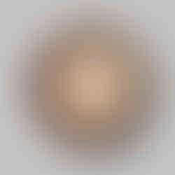
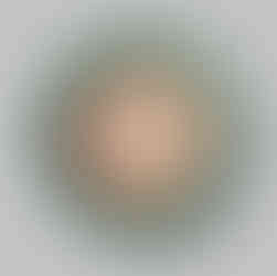
I photoshopped the first image to see what it might look like with a ring of colour around the clock. It would be interesting to have the data for the present day, and then for last year so that there is something to compare it to. I wasn't sure what to have as the third option, so in the end I tried as just the two clocks


I then tried with a simple clock and more space around it. I really like the simplicity of it -


I think this is the most sensible and logical design which keeps it minimalistic and sleek. Although I like the above double clock idea, if it had the top one depicting last years data, and the bottom showing today/right now, both the times would be identical, which is unnecessary. So maybe I could translate that into the singular clock, with two colour rings? Would this add too much clutter and be harder to read?

Comments